See What’s Changing!
Table of Contents
Over the years, we've been continuously modernizing the ClickTime application, often in ways that are invisible to customers. We've scaled our infrastructure to handle far greater transaction volume, designed new APIs, and continuously improved our application's security. Now we're rolling out changes that will be more visible to everyone, and we'd like to explain what our customers can expect in the coming months.
ClickTime has spent the past year in the midst of a project to redesign our administrative pages. The first step in this redesign is the "Person Detail" page. This page lets administrators and managers add and manage people in their company's directory. It's one of the more complex and most-used pages in ClickTime so this project has required great care. It is also the example which will set the design for all new page designs across the application.
We ran a beta test of our redesign of this person detail page earlier this year. We rolled out a functional prototype of a new design to a group of invited opt-in users. We didn't quite hit the mark but the feedback was incredibly valuable -– it showed us exactly how to refine the design before we built the final version.
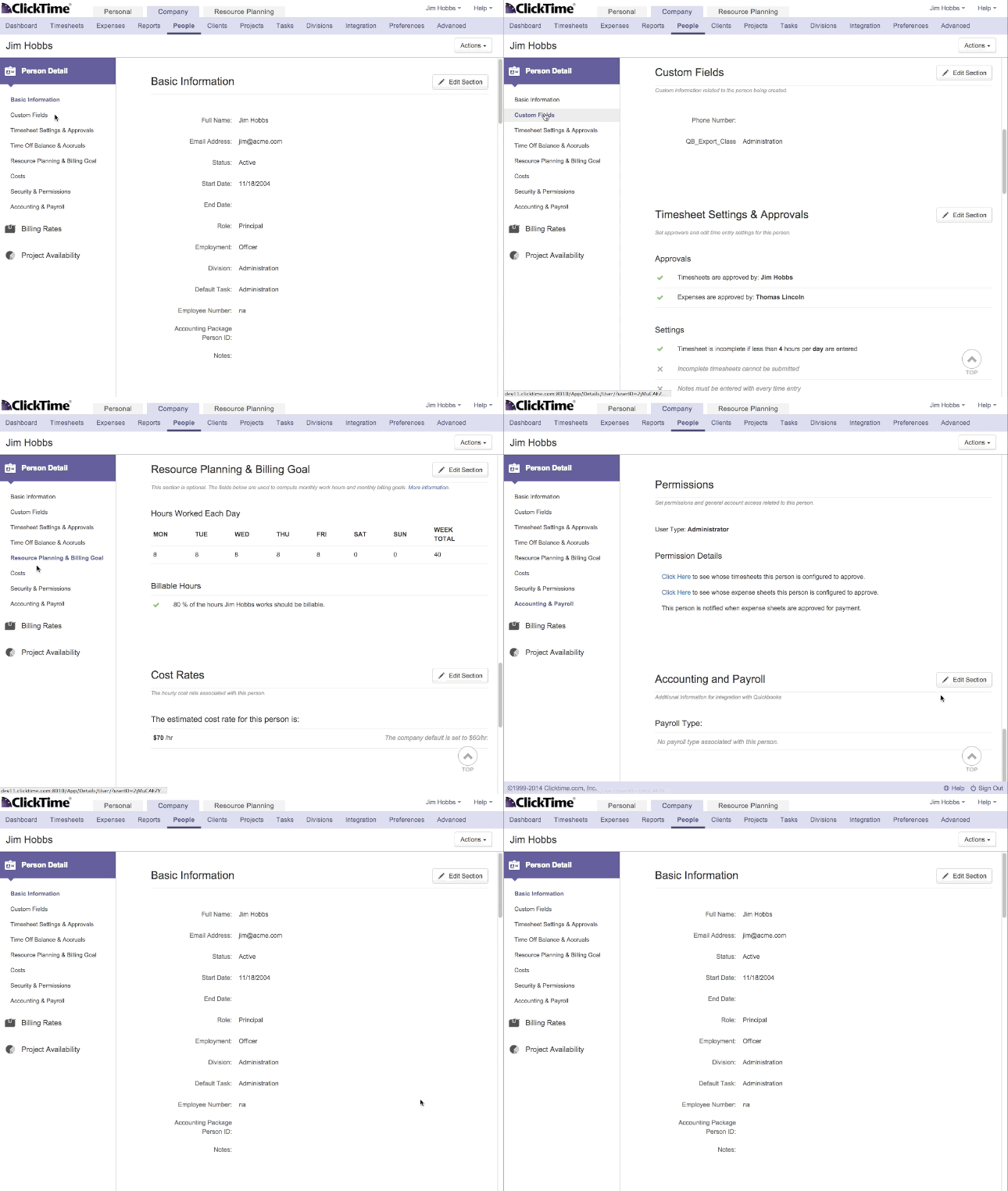
A pain point we identified in our beta was that while we tried to improve the layout of the page, we were also relocating too many common functions, making it hard to find information quickly. To fix this we have kept the sections of the person detail page in the same section order as they have always appeared.
From there we took a step back and tried to identify the other major elements that would support our goals of speed and usability. We needed to think big-picture in how this page's design would be applied to other parts of ClickTime down the road. We feel we have produced a new template that will reinforce common patterns and familiar ways to access and edit information related to your company.
Take a look at what we're releasing. (If you participated in the earlier beta, look closely at what's different):
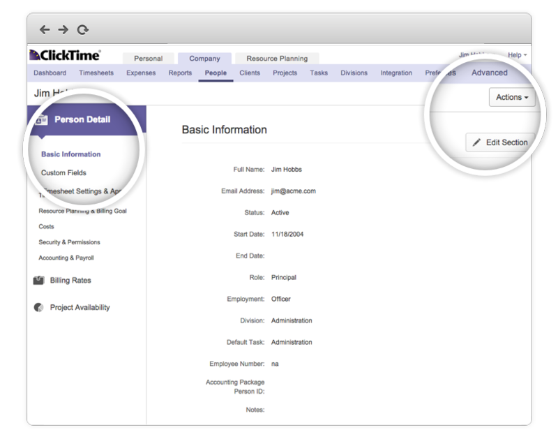
This page has three distinct parts to it that you'll notice on first glance:
- A sidebar - Use this area to navigate to sections within a page, or new pages all together. Click on page sections to get there faster or scroll through to find what you need.
-
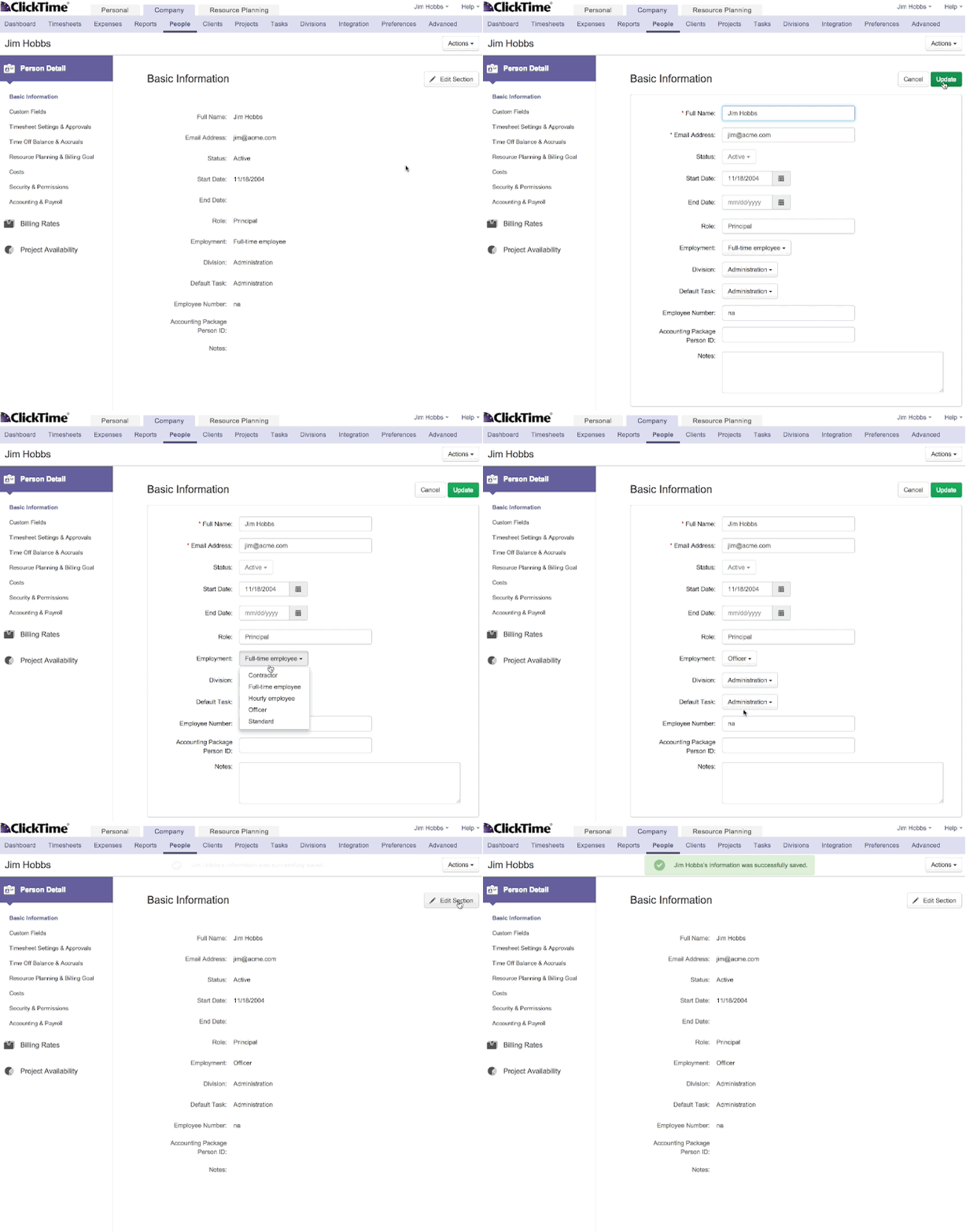
Read and Edit modes - Consuming all the information related to a person (or project, or division, etc.) can be difficult when everything is an open field. We sought to tackle a few issues by introducing distinct modes.
- Legibility
- Being able to instantly see what was just edited
-
An "Actions" menu that lets you perform administrative functions
- Change passwords
- Retrieve audit logs
- Delete the person
Look for updates regarding this release in the coming months and be sure to opt-in for an early look at the new page!


